Provenance: packaging

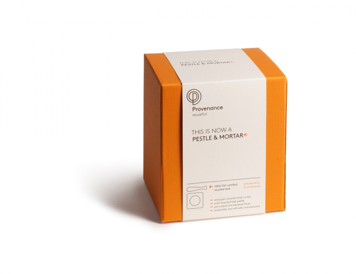
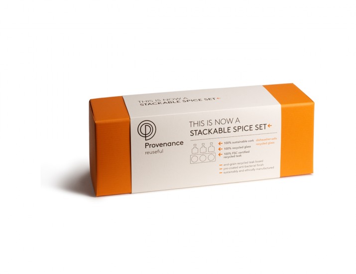
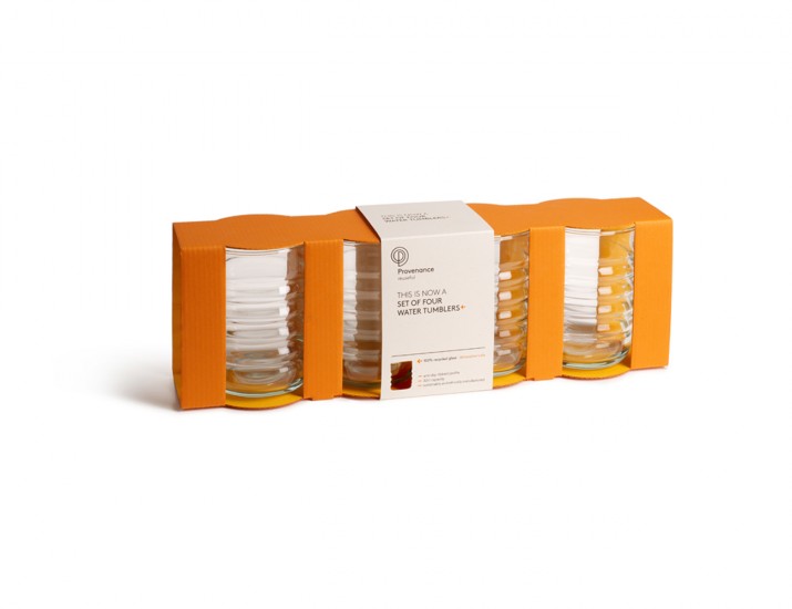
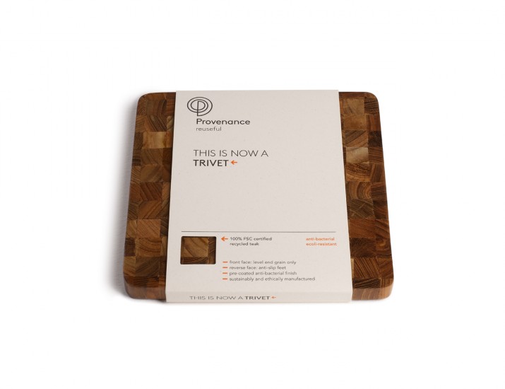
Provenance is an eco-friendly and ethically-sourced homewares brand. Jog was commissioned to create the brand strategy, key brand messaging, brand identity and packaging.

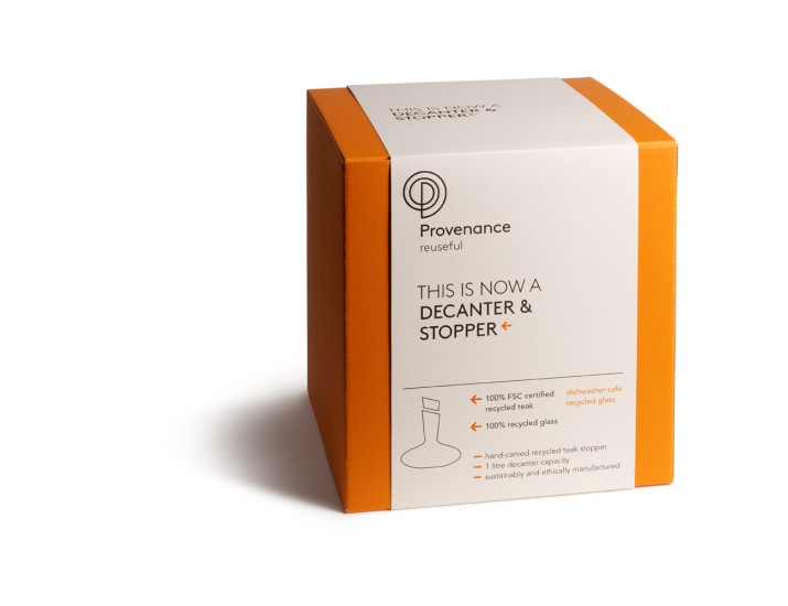
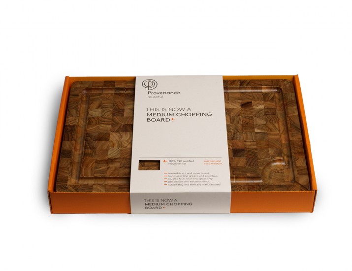
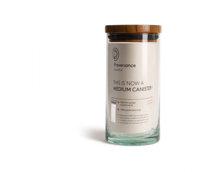
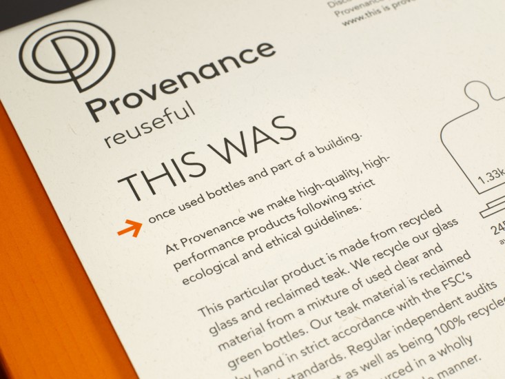
Key to the identity is a strong typographic signature. The strapline ‘reuseful’ and the use of ‘this is now’ and ‘this was’ on the packaging draws people into the story of the materials the products are made from, not just that of the products themselves.

The brand’s eco/ethical ethos was carried through into the choice of materials for packaging, print, signage and exhibitions. All materials were recyclable, most were wholly or largely recycled and a strong emphasis was placed on reuse: the orange boxes, for example, are left unprinted to encourage secondary usage.

In-store research by Jog led to the choice of bright orange for the retail packaging boxes. Packaged products are routinely placed low down by retailers and strong use of colour helps draw people’s eyes to the brand.

The brand’s orange boxes are made from 100% post-consumer waste. They are self-coloured to minimise the visibility of in-store damage and reduce the need to repackage. They are left unprinted to encourage reuse after purchase.

The outer-sleeves use a durable board which is made using pulp from post-consumer and FSC-certified sources. Ink coverage is minimal and the sleeves are blind-embossed rather than foil blocked to ensure recyclability.

Jog’s logo for Provenance is a simple monogram that represents upcycling.

Copywriting is at the heart of Jog’s solution. A narrative begins on the front of each pack with the words ‘This is now’ appearing before each product description to hint at the interesting back story. On the back you find ‘This was’ as the lead into the story of how the materials for each product were sourced.