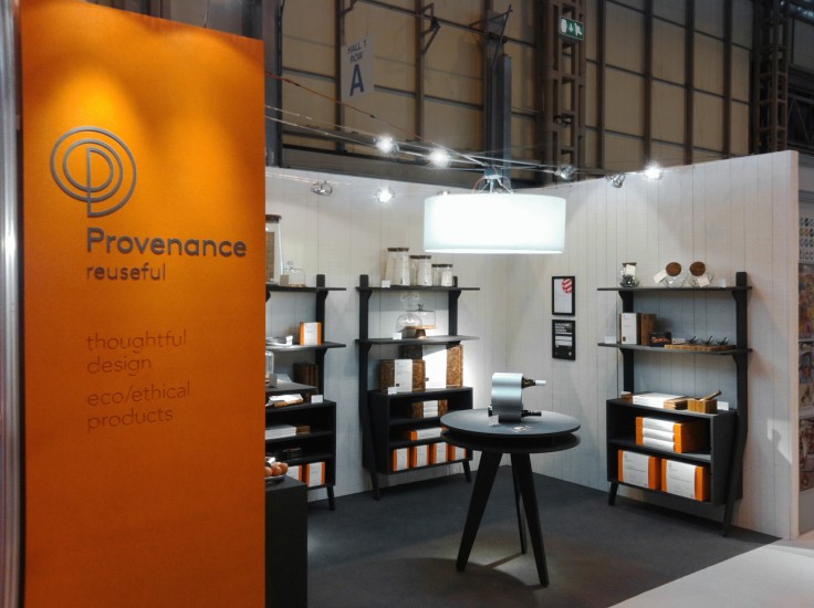
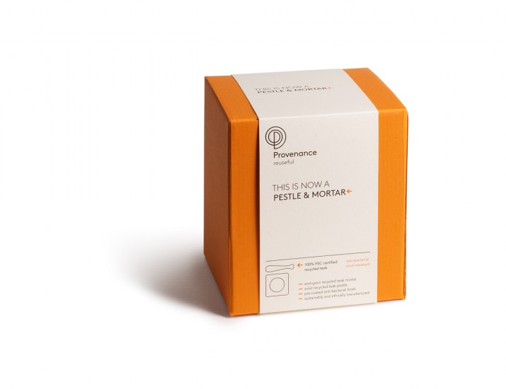
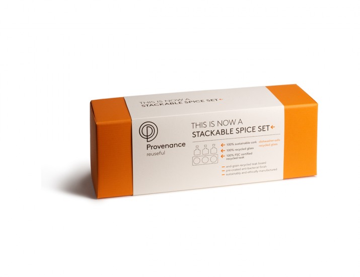
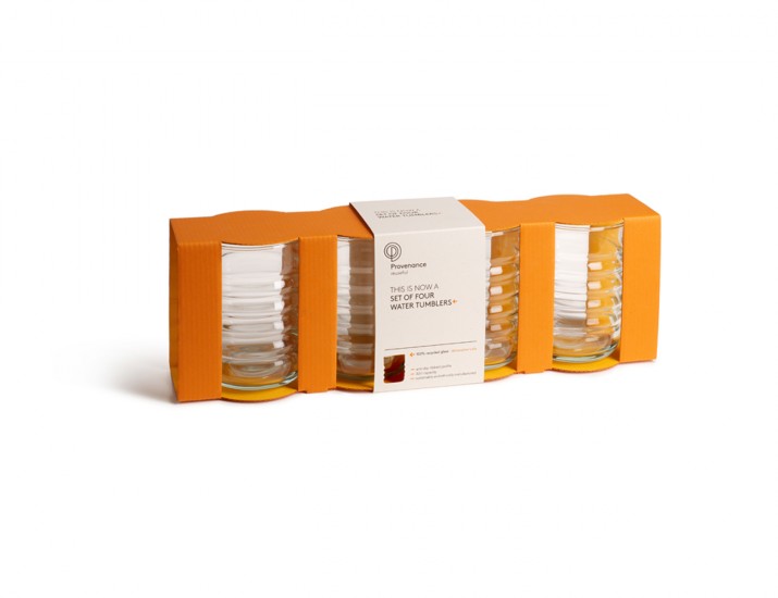
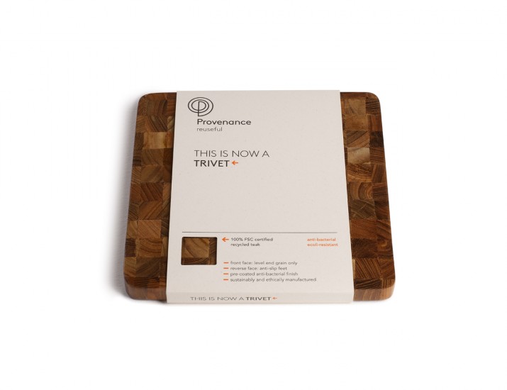
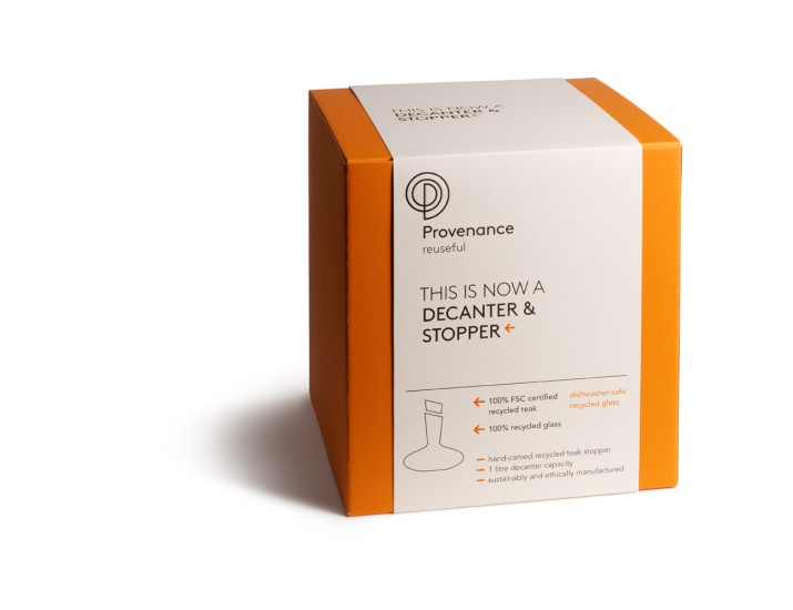
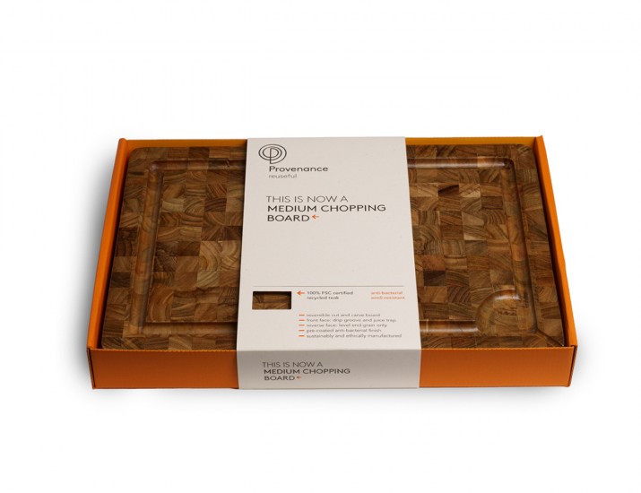
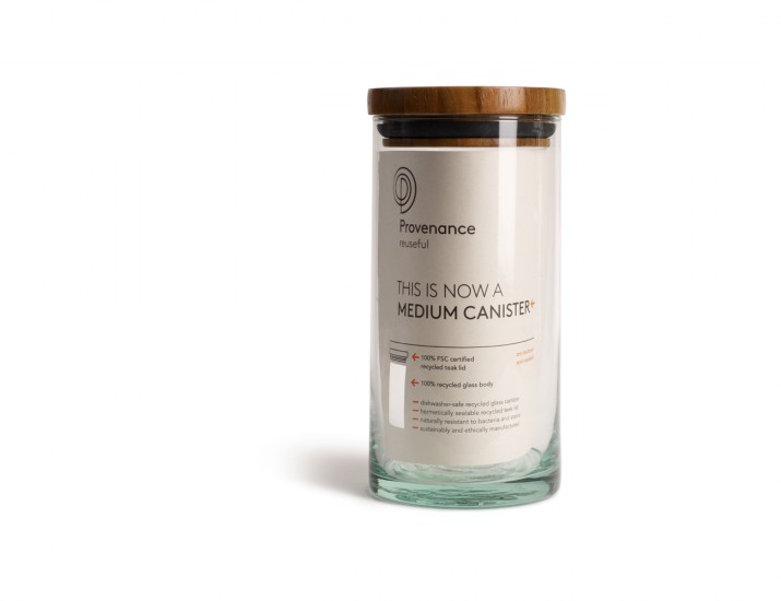
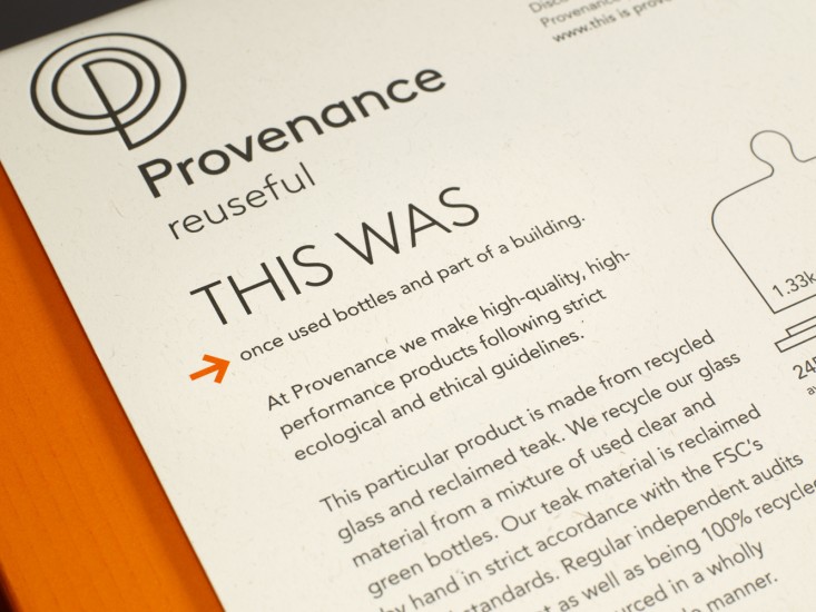
Jog was commissioned to create the branding for new eco/ethical homewares brand Provenance. Provenance designs and manufactures high-quality kitchen and tableware products from recycled teak, glass and aluminium, following strict ethical standards.
As part of its branding process, Jog questioned where the brand might sit in ten years time. It concluded that the market for green products was likely to be much more crowded, or, less likely, much less important. Either way it was clear that brands which rely on green credentials alone would be in a weak position.
In response Jog created a positioning for Provenance that had core values beyond eco and ethical, namely usefulness and high quality of design and manufacture. This positioning was expressed in the simple single-word tagline ‘reuseful’.