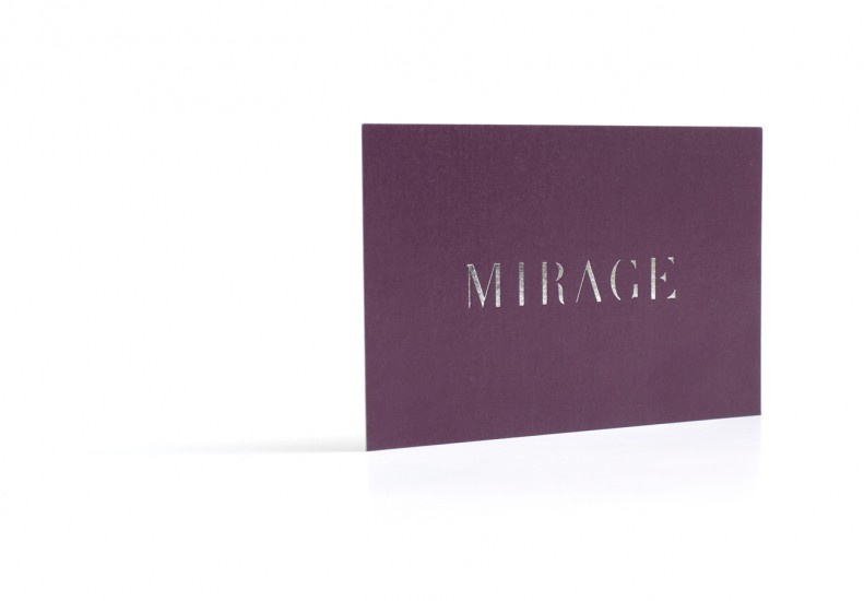
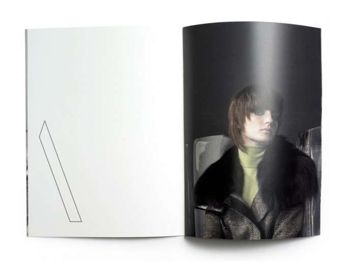
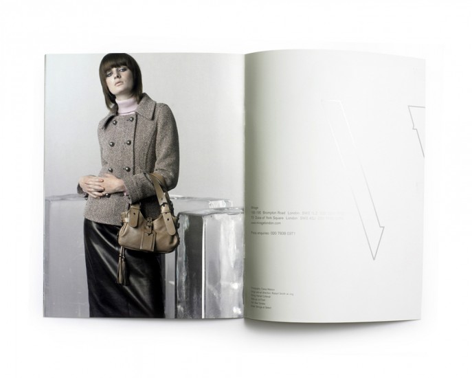
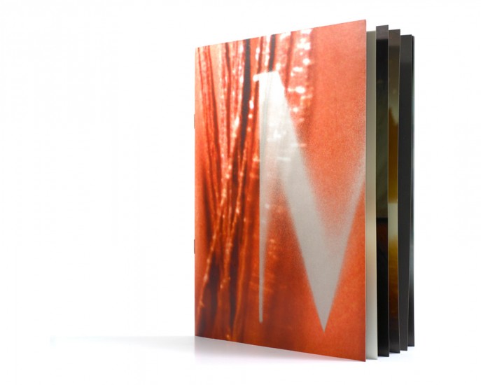
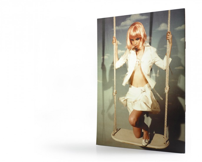
In developing the visual branding for Mirage, a chain of high-end fashion boutiques, Jog developed ideas around the theme of illusion – an idea that’s closely associated with mirages themselves and with fashion.
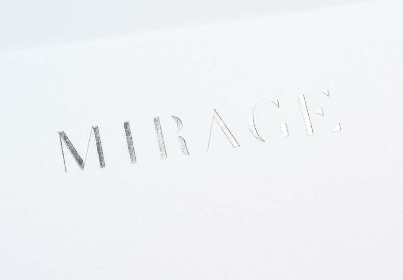
Jog created an appropriate yet distinct logotype by burning away the edges of a classic typeface, inspired by the thinning effect of looking at something against the sun.
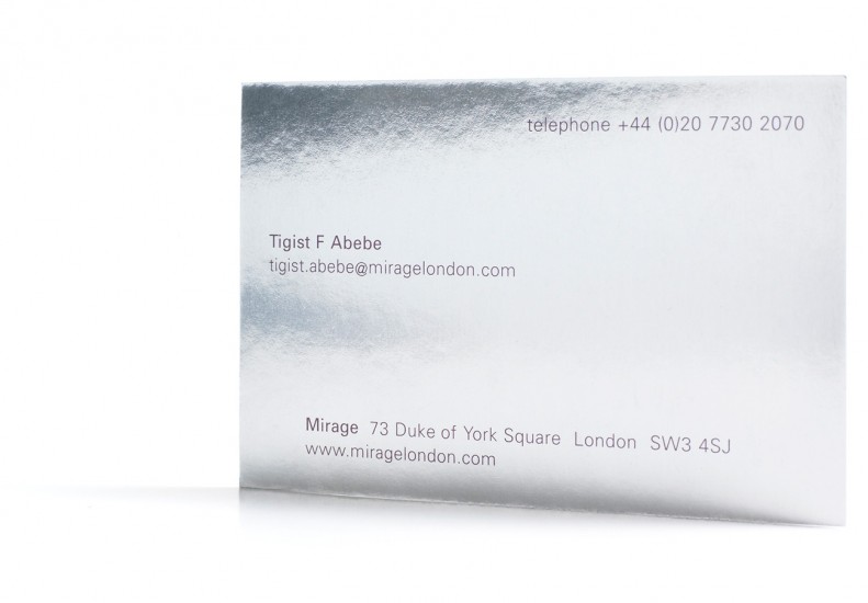
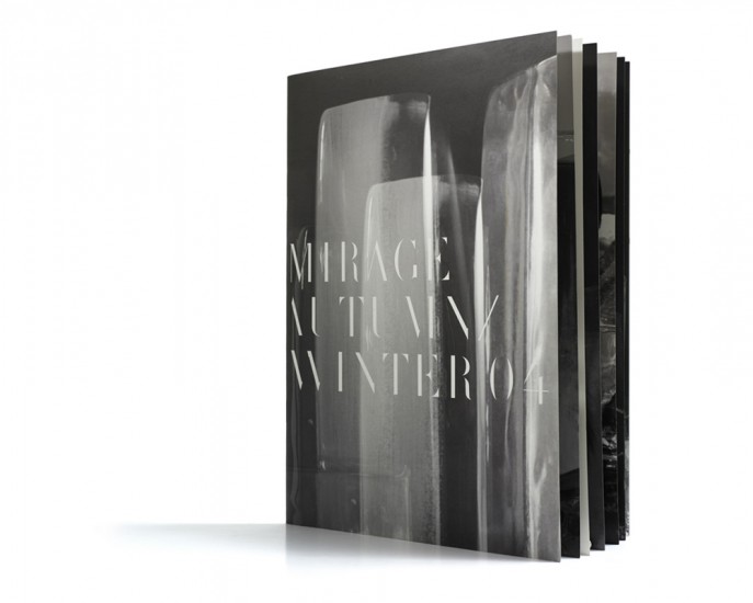
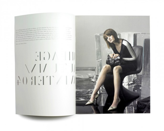
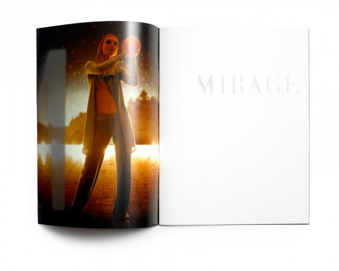
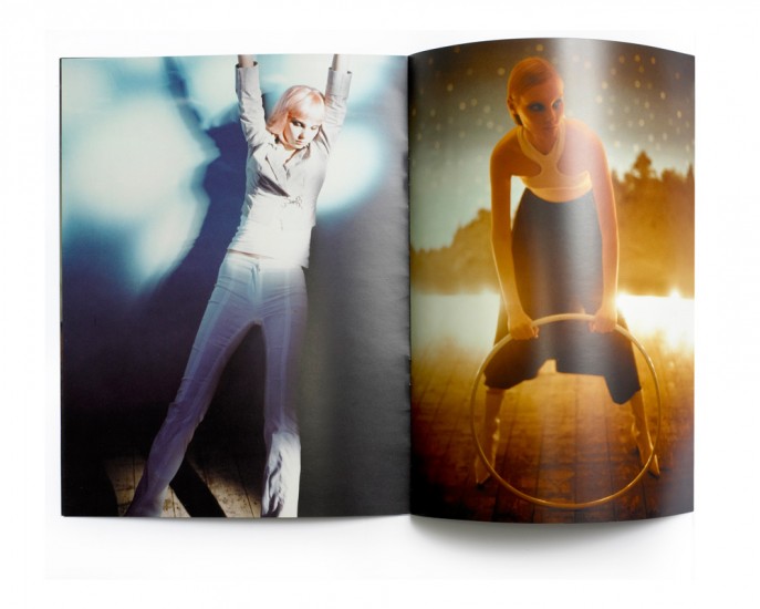
The idea of illusion extended to the extensive use of reflective yet distorting surfaces and finishes on printed material, and a complete alphabet for the pared-back display typeface. This retains its readability despite the fact that around fifty percent of many characters is no longer visible. These elements are the basis of a highly sophisticated. This formed a distinctive brand identity that is also flexible and easy to use in a range of applications.