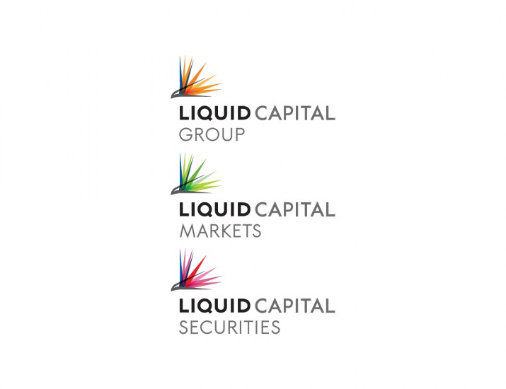
Liquid Capital is a source of pure liquidity for clients in all market conditions. Its derivatives market-making and brokerage businesses are run independently to ensure they are unencumbered by the conflicts of interest that compromise many competitors.
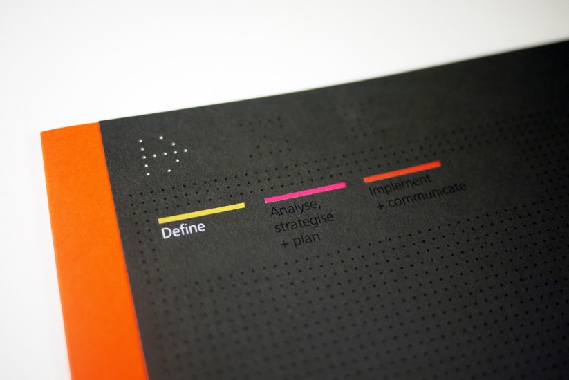
Liquid commissioned Jog to undertake a complete review of its branding.
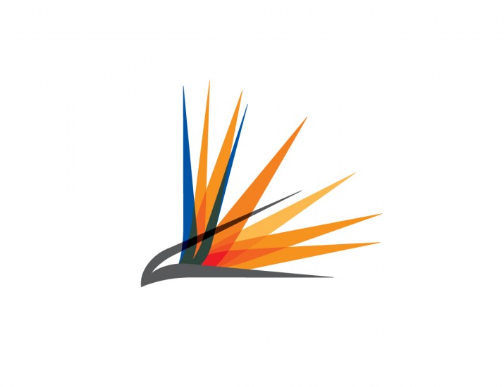
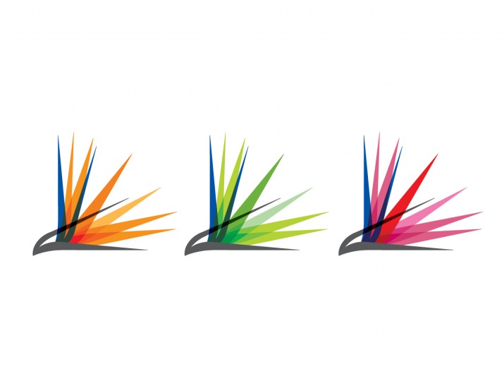
To distinguish Liquid Capital meaningfully, Jog built a brand around the image and idea of a bird of paradise flower. This is a perfect metaphor since bird of paradise plants have very deep root systems. Explorers have used them as a reliable source of water both in rainforests, where water is abundant but may be contaminated, and in deserts where water is scarce and a bird of paradise plant signals a deep and hidden source.